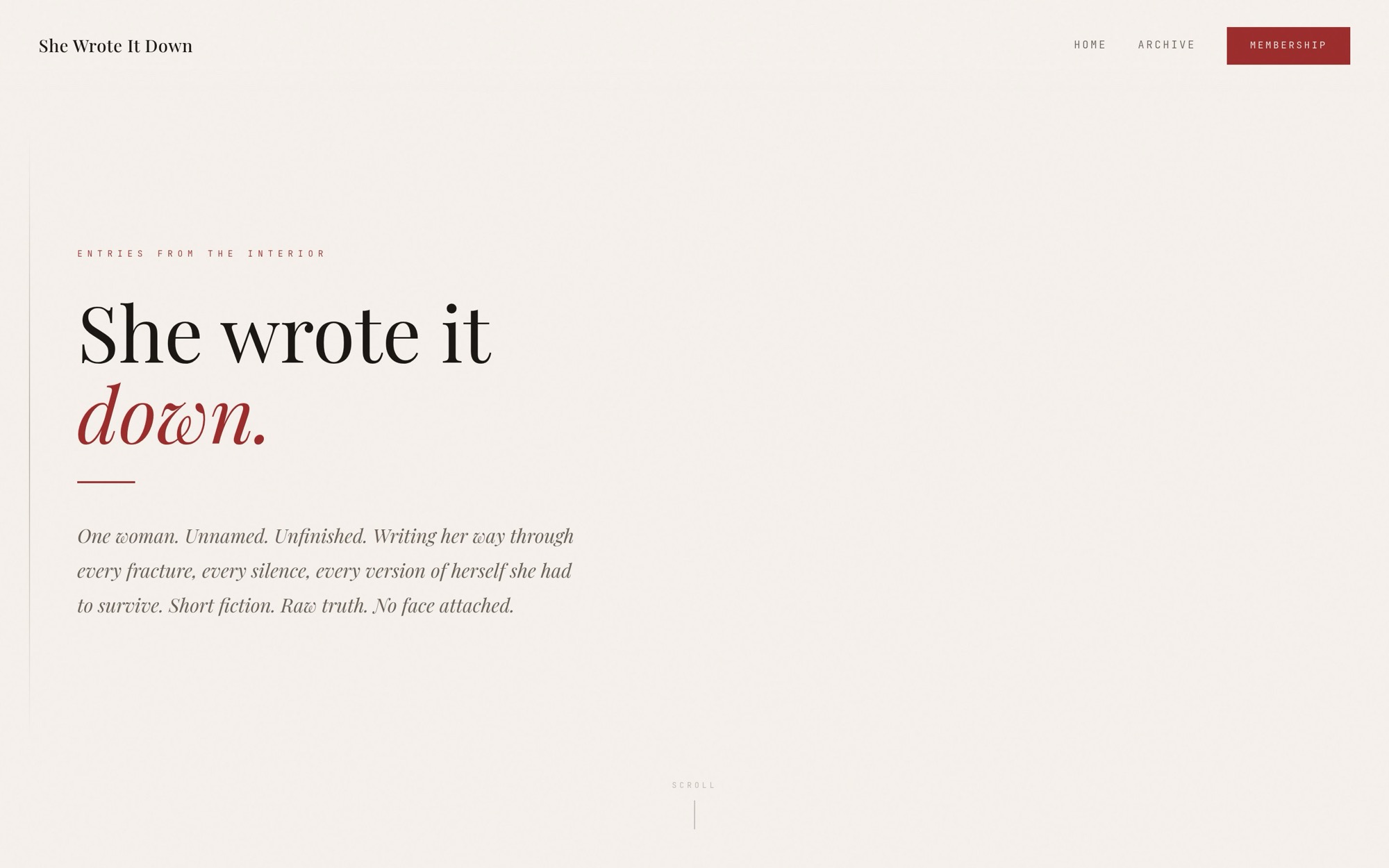
This one is almost all restraint. There is no author photograph, no byline, no sidebar and nothing moving. The whole design is a serif, a measure and a lot of space, because anything else would compete with the writing.
Behind it sits an archive and a membership, so the reading is free and the depth is paid for.
Worth saying
It is the clearest example we have that a good site is not a busy one. The build is small, fast and almost entirely text, and it holds attention better than sites with ten times the moving parts.